Related Article: Create New Section: Form
The Form Structure can be edited in two places
- In a Template TMail.
- In the c# where the Form Section is first created in a Basic TMail.
For a Form Section, you can design a custom form with different Fields and setup their respective properties. All these options are available in following three buttons.
- Form Properties: Use this button to setup the Form Properties including its Title, Description and basic layout settings
- Add a Field: Use this button to add a new Field such as a new Textarea or a Checkbox list
- Field Properties: Use this button to setup Properties of the selected field. You can add UI text for the Form, validations, and other values for layout or structure of the Field.
Form Properties
Click on Form Properties button to setup the Form properties, as below.

Title
Write the Title of Form such as ABC Quick Survey or 2016Q2 HR Feedback. The Form Title is distinct from the Form Section title.
Description
In Description area, write the description of Form that help associated Users use and fill the Form accurately. In Font Style, select a Font Style option for Bold, Italic, Underline, or a combination of these three styling options.
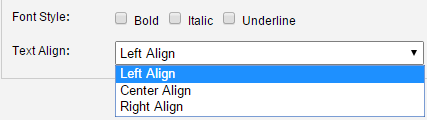
Click on the Text Align drop down arrow to see the alignment options for the Form Description, as below.
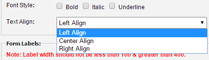
- Select Left Align to align the Description text in the left side.
- Select Center Align to align the Description text in the middle, horizontally.
- Select Right Align to align the Description text in the right side.
Form Labels
Width: This is the space for the width of labels (in pixels). Note that the this label width cannot be less than 100px or more than 400px. Click on the Preview link available corresponding to the Form Title to see how the Form layout responds to the Label Width values that you try.
Font Size: Select a Font Size for the Form Labels’ text.
Fields and Properties
You can add following Fields to the Form.
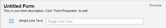
- Single Line Text: Select this Field if you want to add a Single Line Text Field to the Form. For example, to capture User’s Name, Role, Organization, or Email address.
- Paragraph Text: Select this Field to add a Paragraph Text Field to the Form, such as to capture descriptive comments, note, or feedback by the Users.
- Checkbox (Single): Select this Field to add a Single value Checkbox Field to the Form. For example for a field as ‘I accept the terms’ or ‘I have the permissions to fill the Form’.
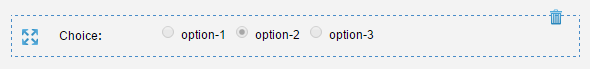
- Choice (Radio Buttons): Select this Field to add a Multiple Choice Field to the Form. When you add this Field, you can define different values for the Field and the Users can select only one value as an option. For example, you can use it to help Users select an Age Group such as 24-29, 30-34, 35-44, 44 and above. In this case, Users can select only one option.
- Checkboxes: Select this Field to add a Multiple Choice Field to the Form. When you add this Field, you can define different values for the Field and the Users can select multiple values from the list of options. For example, you can use it to help Users Select Languages they know from English, Spanish, French, German, or <any other language>. In this case, Users can select multiple options.
- Drop Down: Select this Field to add a Drop Down list Field to the Form. When you add this Field, you can define different values for the Field and the Users can select only one value as an option. This Field is similar to the way Choice (Radio Buttons) works, the difference is in the design and usability.
- Action Buttons: Select this Field to add Action Buttons to the Form. For example, the buttons to Submit, Reset, or Cancel the Form details.
- Date Picker: Select this Field to add a Date Picker to the Form. In this case, a small Calendar icons is available for the field and Users can click on the icon to see the Calendar. You can use it to help Users select a date such as Date of Purchase, Date of Joining the Organization.
- Display Text: Select this Field to add a descriptive text on the Form. Users can only see the text and they cannot interact with this Field.
- Divider: Select this Field to draw a horizontal separator line in the Form. You can use it to keep related Fields separate from other Fields, particularly in long and complex Forms.
All these Fields have some common Properties as well as their unique Properties.
Common Properties
The following Properties are common to all Fields.
In Label fieldset:
- In Title, enter the title of the Field.
- In Font Size, select the font size for this Field.
- In Font Style: Select a checkbox to define the font style whether you want to show it as Bold, Italic, Underline, or a combination of these three options.
In Field fieldset:
- In Name, enter the Name of the Field. This name will be used (in the future) to search specific form fields as well as programatically set and retrieve values of a form field.
In Validation fieldset:
- Select Required checkbox if you want to make the field as mandatory to fill.
Field Specific Properties
Form Field 1: Single Line Text
In Field fieldset:
- In Hint Text, write the small text that you want to show in the Field itself.
- In Default Value, write any default value that you want to show in the Field itself. Note that the text in this Field overrides the text in Hint Text field.
- In Disabled, select the checkbox if you want the field to be disabled so that data cannot be entered in the Form Fill mode.
In Validation fieldset:
- Select Email checkbox if you want users to fill an email address in the field. In this case, the Form shows an error message if users do not use @ in the text that they add to this Field.
- In Character drop down list, select an option to setup the input type validation whether you want only Numeric text, only Alphanumeric text, of a mix of Numeric and Alphanumeric text.
- Word Limit: In Min Length, specify the minimum word limit for the User input text for this Field. In Max Length, specify the maximum word limit for the User input text for this Field. Note that the maximum word limit cannot be more than 80.
Form Field 2: Paragraph Text
In Field fieldset:
- The Hint Text, Default Value, and Disabled, Fields work the same explained for Single Text Field Properties, earlier in this article.
- In Initial Visible Lines, write the number of text lines that you want to show for the textarea field. The number of visible lines determine the height of the field. As you write a value here such as 5, 10 or 20, you can see the height changing in real time.
- In Max Visible Lines, write the number of maximum visible lines that you want to allow to see when the User input text exceeds beyond the visible space in the Field.
In Validation fieldset:
- You can set the Properties as explained for Single Line Text Properties, earlier in this article.
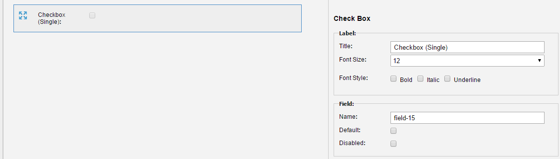
Form Field 3: Checkbox (Single)
In Field fieldset:
- In Default, select the checkbox to show the field as selected by default.
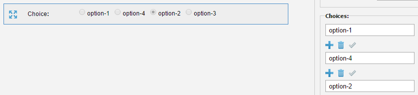
You can see the default options in the first column for each option, as option-1, option-2, and option-3. Write down the relevant option names and see the changes in real time in the Form design area.
For each option, you can see the following icons for different actions.
Add After: Click on <icon> to add a new option at the same location where you click on this icon. For instance if you click on this icon for first option, option-4 is added as the second option, as below.
Delete: Click on the trash icon to delete the option.
Make this option default: Click on check icon to show make this option be selected by default.
Import Options: You can also bulk import the options by writing these once, validate for the format, and then import as options for this Field. Click on Import Options link and the Manage Choice Dialog Box appears, as below.
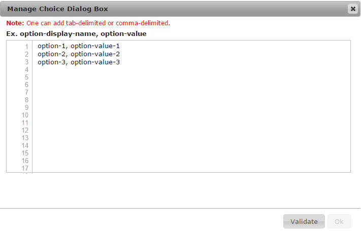
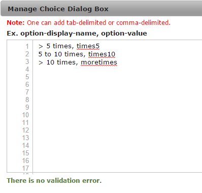
For each line number, write the option name followed by the option value. The From design view shows only option name. The option value will be used (in the future) to enable searching and allowing developers to programatically get and set options. For example, you can copy these from an external document such as a CSV file and paste these in this dialog, or you can write these options manually as below,
Click on Validate button to validate your entries for the format. Note that if you write the option values in some incorrect format, you see some validation errors, for example as below.
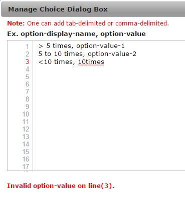
In this case, the option value begins with a number (10) and it should begin with an alphanumeric character and not a number.
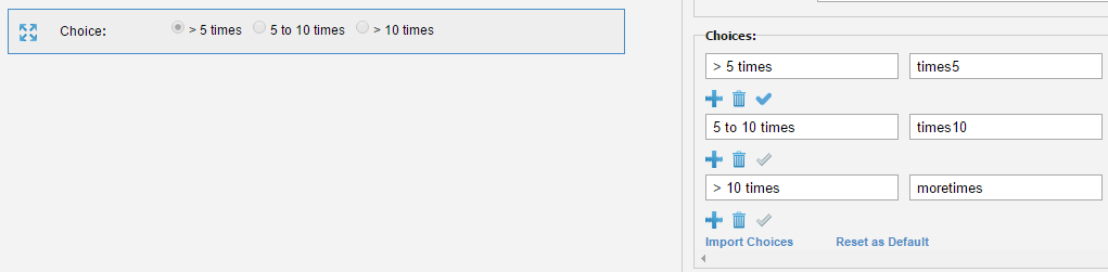
Once you enter all options and see that there is no validation error, click on OK button on the dialog box. The options are added to the Form design view, as below.
Reset as Default: Click on Reset as Default link to reset all values to the default values that you see when you add this Field.
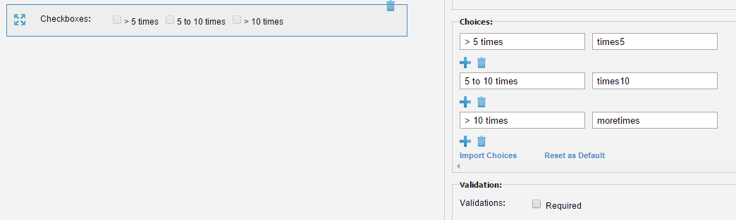
Form Field 5: Checkboxes
All the Form design options for this Field are exactly same as explained for Choice Field, earlier in this article. For Checkboxes Field, you see an additional option as Validation which is also explained in Common Properties, earlier in this article.
After you add the options manually or by using Import Choices link, you see the Field as below.
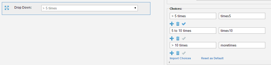
Form Field 6: Drop Down
All the Form design options for this Field are exactly same as explained for Choice Field, earlier in this article. After you add the options manually or by using Import Choices link, you see the Field as below.
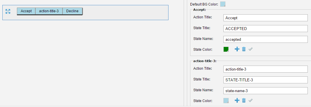
The Field shows Accept and Decline as two Action Buttons added to the Form. For each button:
Default Background Color: In Deafult BG Color, click on the color icon to see color options for the button background. Pick a color as required.
In Action Title, change the text that you see on button, if required. For example, Submit or Cancel.
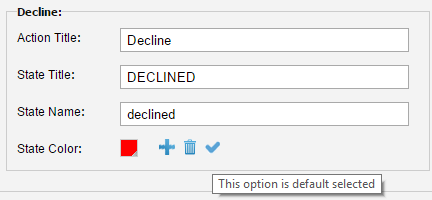
In State Title and State Name, you can change the text as these states are for internal reference. The text for these two fields does not appear on the Form design area.
State Color: Click on the color icon to pick a background color for this specific Action Button. This helps you to have difference background colors for different Action Buttons.
Add After: Click on <icon> to add a new Action Button at the same location where you click on this icon. For example if you click on this icon below the Accept Action Button, a new Action Button adds to the Form and to the Choices area, as below.
Delete: Click on the trash icon to delete the Action Button.
Make this option default: Click on the check icon to show this action executed by default. In this case, only the resulting state is visible though they can see an undo button to undo the action. Take an example where you select the Execute this Action by default for Decline button, as below.
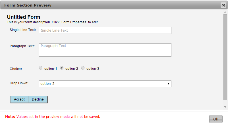
To see how it works, click on the Preview link available to the right side of the Form Title. The Form opens in a dialog box, as below.
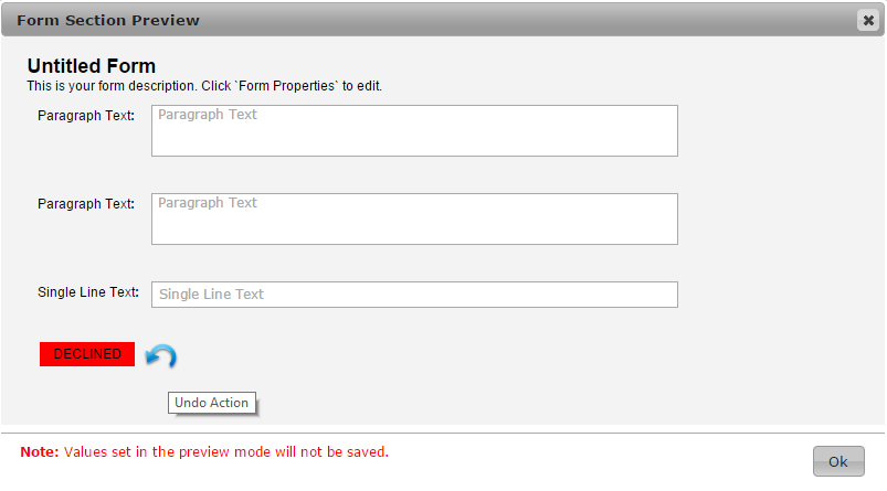
The field appears as if the Decline action was executed and thus the user can see the resulting state, i.e. DECLINED. Click on that Undo Action icon and now you can see all three Action Buttons that you added to the Form, as below.

Click on either of these Buttons to toggle between Buttons View and the Action-Executed View.
Form Field 8: Date Picker
The Field helps associated Writers to select a Date, as below.
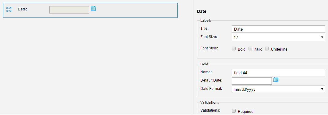
In Field fieldset:
In Default Date, click on the Calendar icon to select a date, as below.
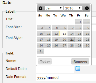
The date is added to the Field. You can click on the Remove option to remove the date from the Field.
In Date Format, select the format to show the date on the Form, as below.
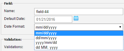
The Date format changes in the Field based on the option you select in this Date Format list.
Form Field 9: Display Text
In Text fieldset:
In Text, write the text that you want to show on the Form.
In Text Align, select an option for how you want to align the text on the Form design page, as below.
Common Operations
For all the Fields available for the Form design, you can take some common actions.
Reorder Fields
You can reorder the sequence of Fields by drag-and-drop action. Select the Field and press the mouse over as you do for a conventional drag-and-drop action. Move the Field up or down and release the mouse over where you want to place it.
Preview
At any stage of Form design, you can preview it to see how it appears to the associated Writers. Click on the Preview link available to the right side of the Form Title, as below.
The Preview opens in a dialog as below. In the preview the Form is in ‘Fill-mode’ although the results of the data entry are not saved once the preview is closed.
Delete a Field
Select a Field and you can see a small Delete icon on the Field, as below.